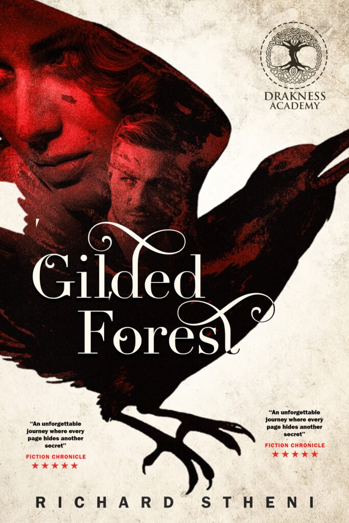
Most people see the final cover.
I see hundreds of tiny design decisions.
This concept started with one question:
How can I tell the story without showing everything?
Instead of placing every character separately, I built the composition around a raven silhouette. The raven isn’t just decoration—it’s the visual frame that connects every major element of the story.
Then I focused on hierarchy.
The reader’s eye should move naturally:
- Title
- Main face
- Supporting character
- Raven silhouette
- Author name
If the hierarchy is confusing, the cover becomes confusing too.
Color was another important decision.
I limited the palette to deep reds, black, and warm ivory. The red creates tension and mystery, while the textured background keeps the cover feeling grounded instead of overly polished.
The typography was intentionally elegant with decorative swashes. I wanted it to feel like dark fantasy while remaining easy to read as a thumbnail—because that’s where most readers discover books today.
Finally, I added subtle textures and blended the portraits into the raven rather than placing them on top. That helped create a single visual instead of several disconnected images.
A book cover isn’t just about making something look beautiful.
It’s about communicating the genre, mood, and promise of the story in just a few seconds.
That’s the challenge I enjoy most.
💬 Which element catches your attention first—the raven, the title, or the hidden portraits?
Leave a Reply